
Zeropark
Zeropark - Sign-up process redesign
- requirements analysis
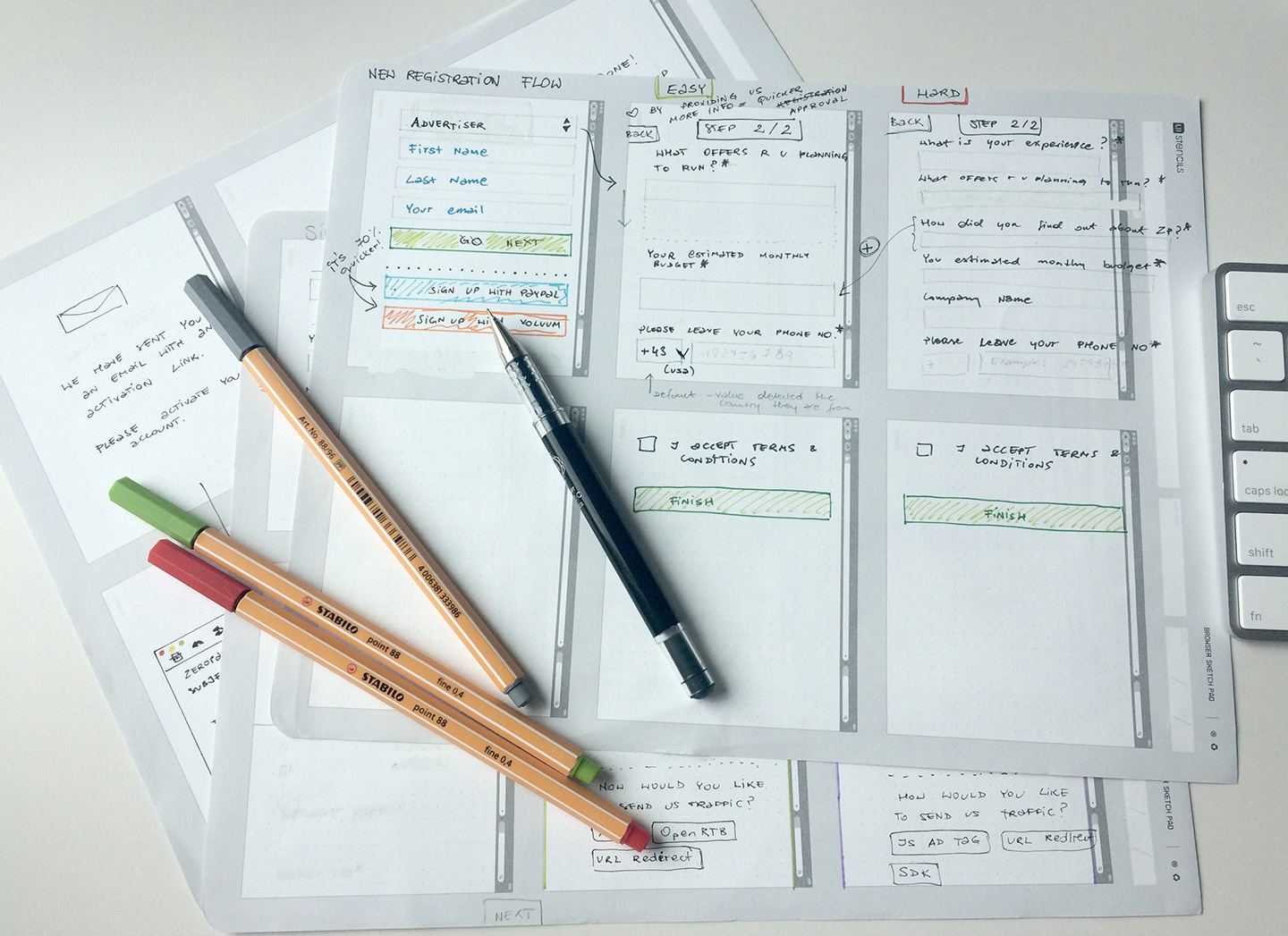
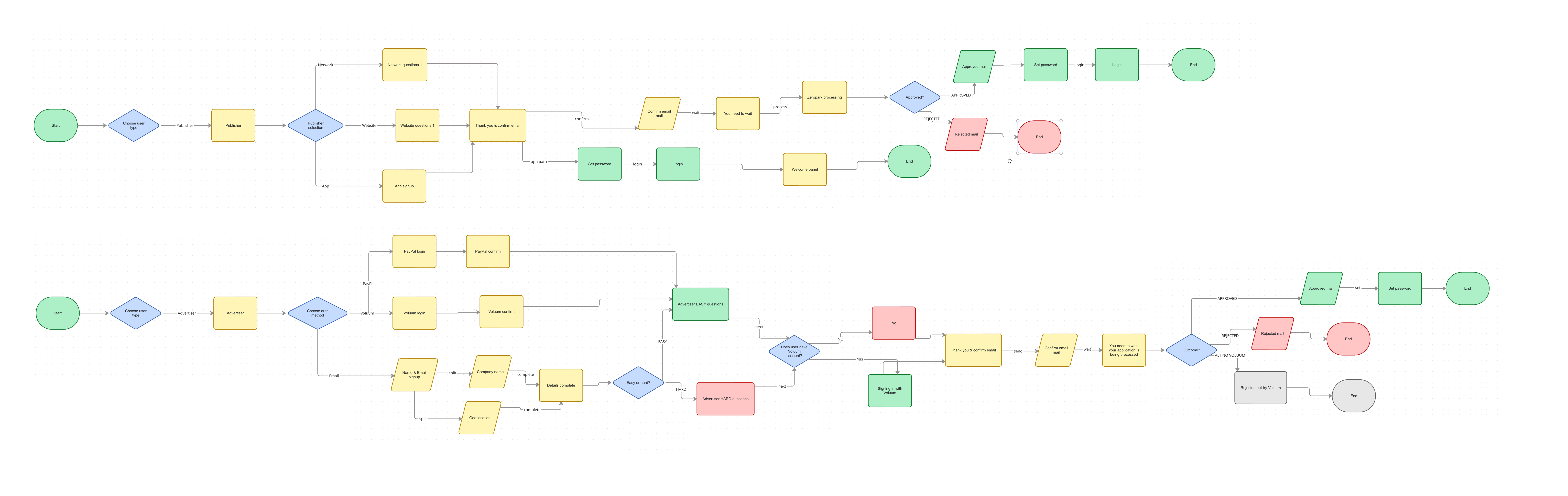
- preparing the users journeys
- defining Information Architecture
- A|B Testing
- designing the sign-up flow using existing guidelines
Company: Team Internet
Time frame: 2 weeks
Target group: Affiliate marketers
Challenge: To simplify the registration process for most users while supporting necessary verification steps
Zeropark is a self-service advertising platform that allows advertisers to reach their target audience through various channels. The sign-up process for Zeropark was complex and time-consuming, which led to a high drop-off rate among potential users. The goal of this project was to redesign the sign-up process to make it more user-friendly and efficient, while still ensuring that necessary verification steps were in place.
Old sign up form:

The original form asked for multiple data points on a single, intimidating page. After auditing the required fields with the product team, we stripped it down to just the absolute essentials. To reduce cognitive overload, I "chunked" the remaining process into bite-sized, sequential steps with a clear progress bar, making the task feel much faster and more manageable.
Click the image for more details (opens in a new tab):
Inline Validation & Clear Error States
Previously, users only found out they made a formatting mistake after hitting the final "Submit" button. I introduced real-time inline validation. Fields displayed helpful, human-readable feedback immediately as the user was typing.
A|B Testing
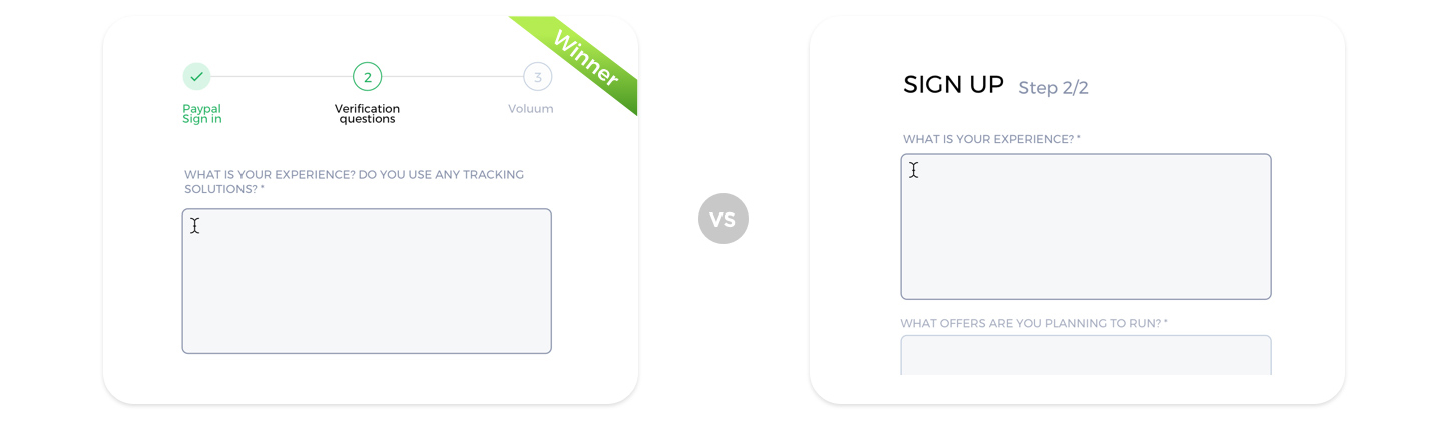
A/B testing I conducted showed a strong preference for higher contrast when users were selecting tags. This led to further testing, and ultimately, global changes were made to our design system.

A long form was split into multiple steps to reduce cognitive load. I tested visual represantation of steps. 85% (of 7 users) picked timeline style over step counter:
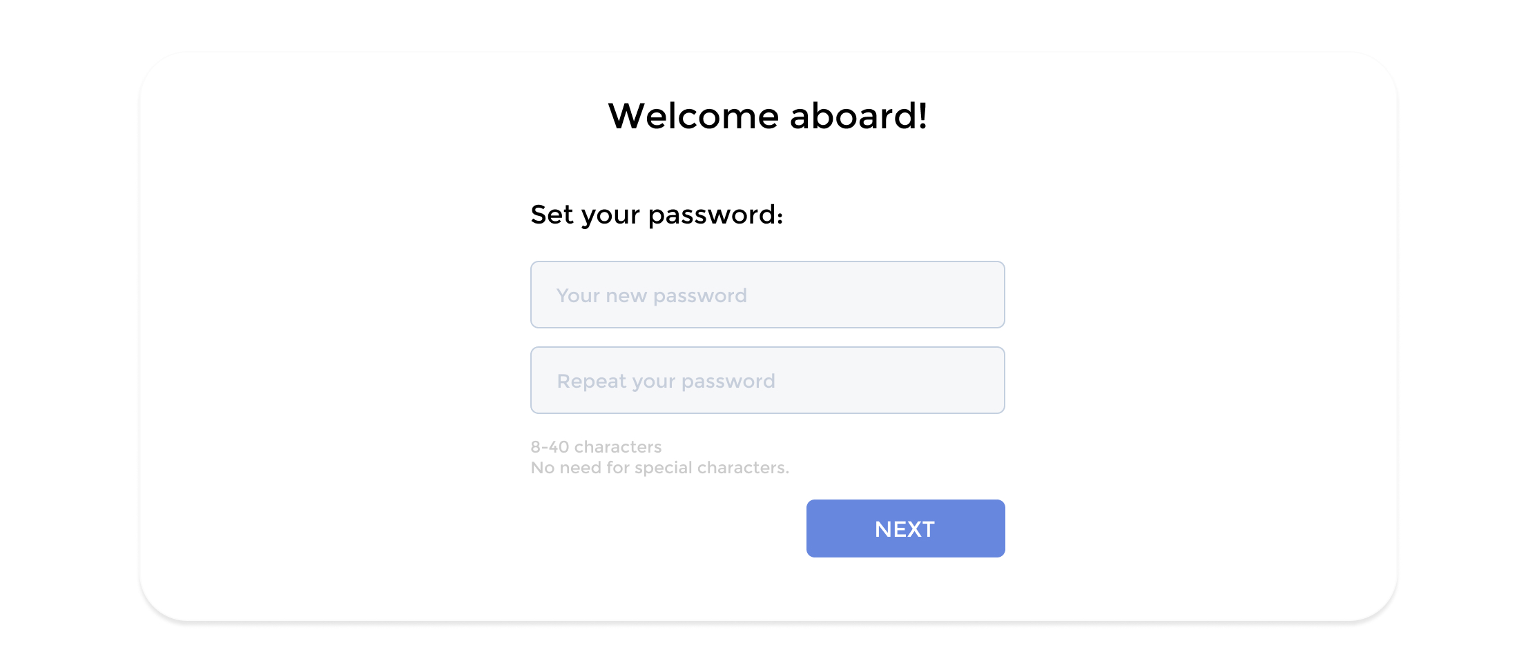
Avoiding Unnecessarily Complex Password Requirements
Initially, our system demanded a frustrating mix of uppercase letters, numbers, and special characters. UX research shows that forcing these complex constraints often leads to severe cognitive overload, form abandonment, and users simply forgetting their passwords immediately after creation.
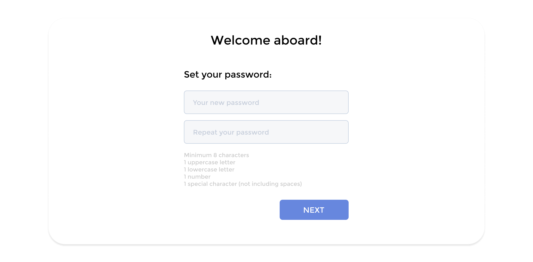
Streamlining Password Creation
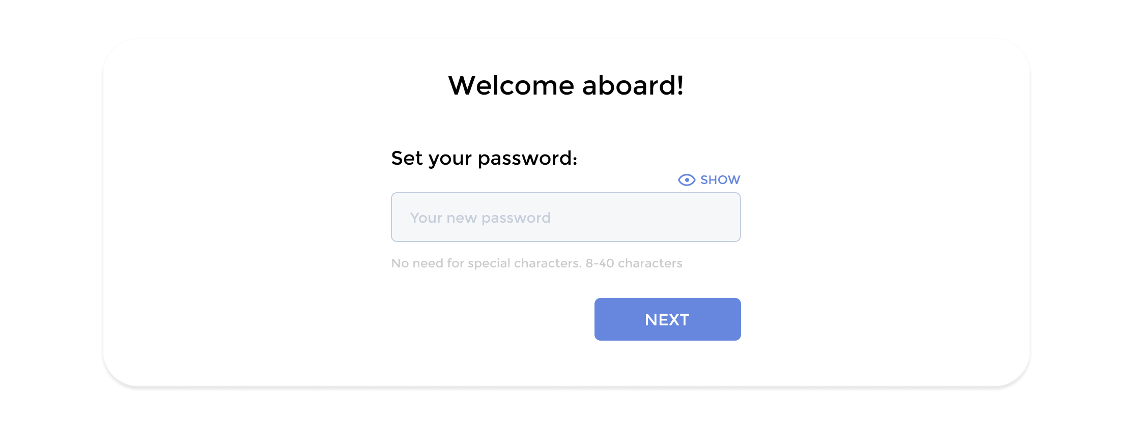
A key decision in reducing friction was eliminating the traditional "Confirm Password" field. UX research shows that forcing users to type a complex password twice—especially on a small mobile keyboard—frequently leads to typing errors, frustration, and form abandonment. Instead, I opted for a single password input field paired with a "show password" toggle (the eye icon). This modern approach drastically cuts down on typing time while still allowing users to visually double-check their entry for typos.
Final version of the password creation step:
Final Conclusions & Impact
Ultimately, the success of this project came down to identifying and systematically dismantling the friction points within the user journey. By challenging the traditional "sign-in wall," simplifying overly complex password requirements, and rigorously validating our layouts through A/B testing, we transformed a frustrating chore into a seamless onboarding experience. The data proved the value of our user-centric approach: post-launch analytics confirmed that the redesign achieved a 12% increase in conversions.