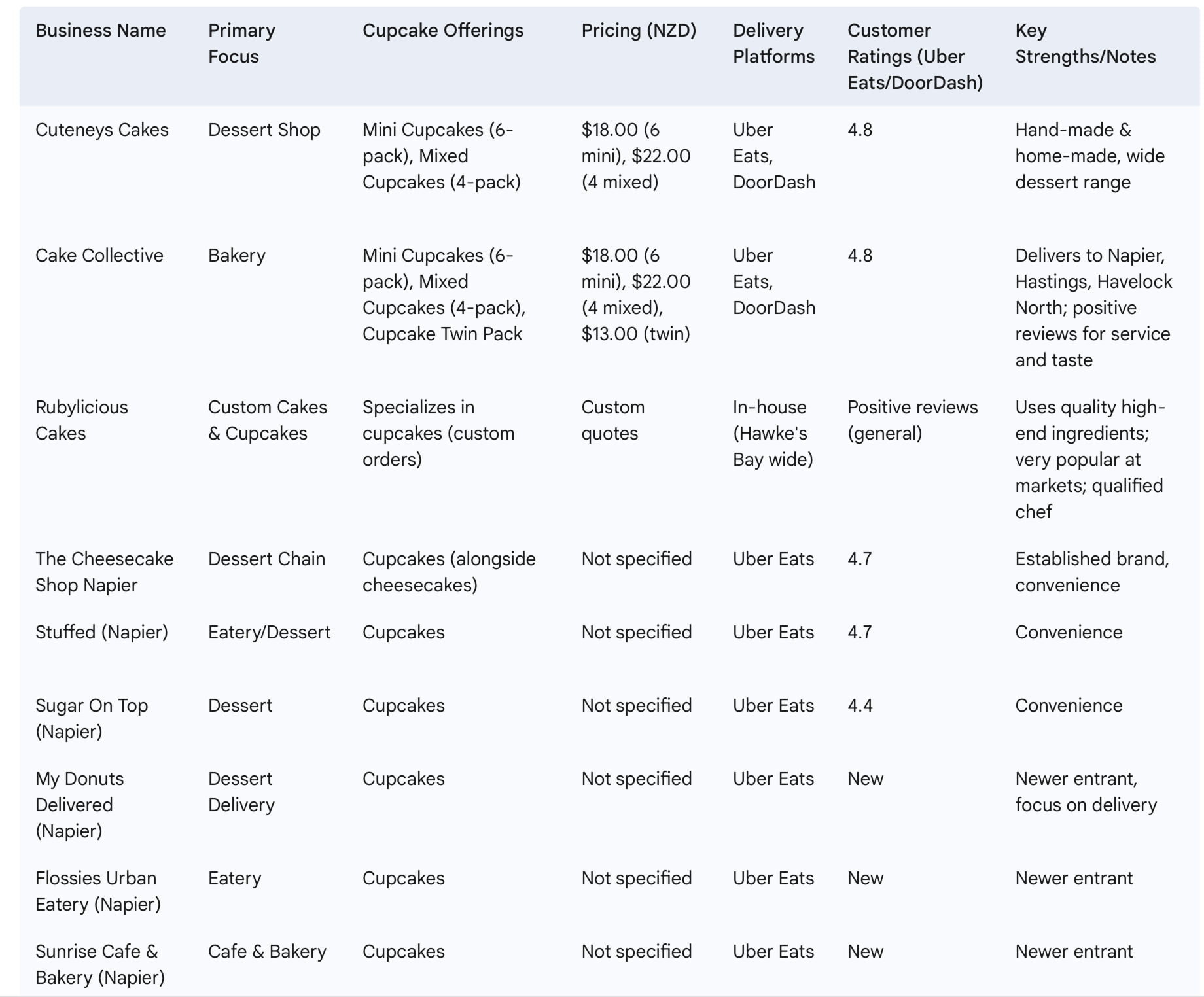
Cake Collective
Cake Collective is a small local bakery offering cupcakes, cakes
The challenge was to reposition the brand in a competitive market by creating a more premium and conversion-focused website experience.
My role:- page review, A|B user testing, functional testing
- re-designing the logo and the website
Problem statement
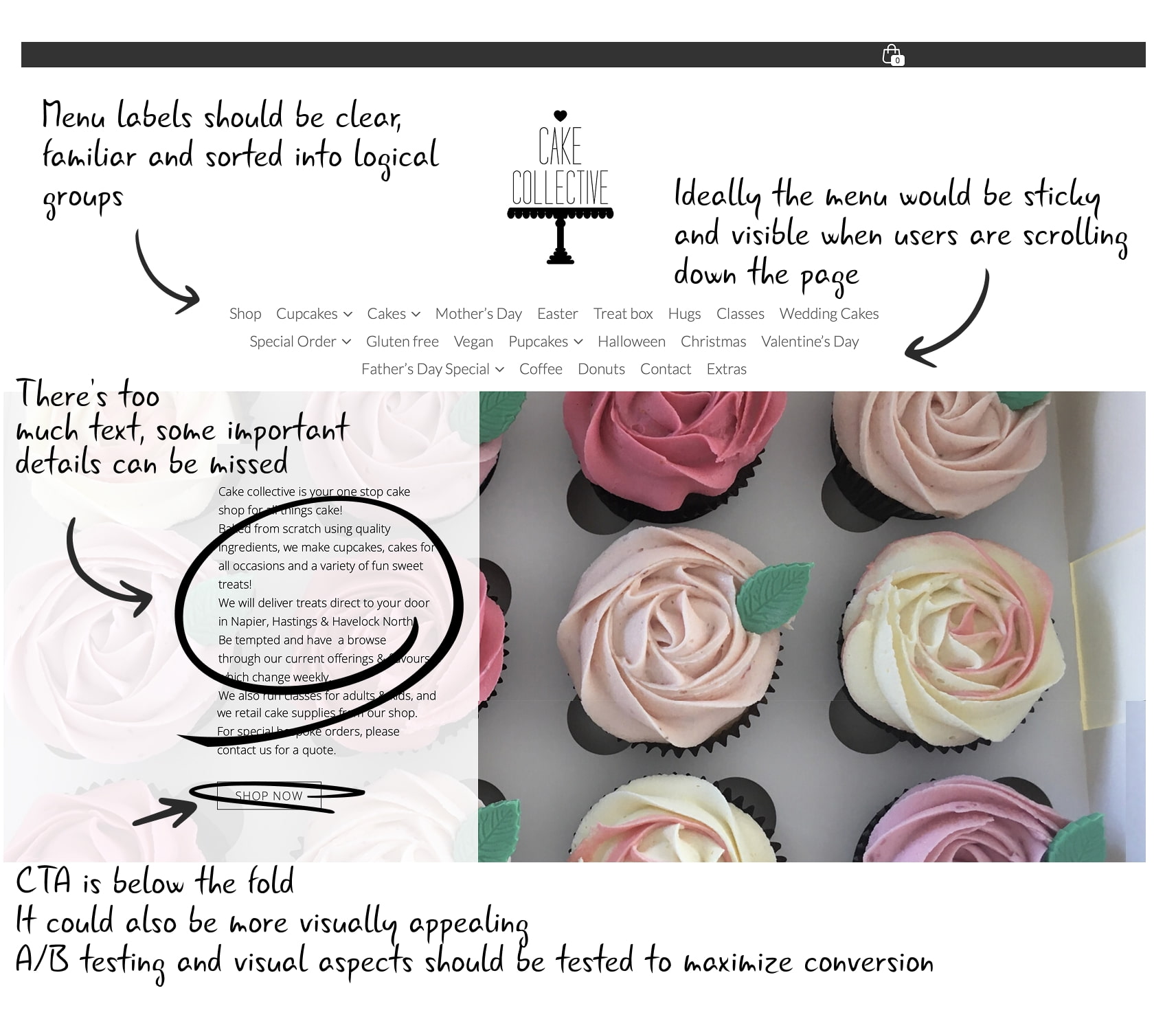
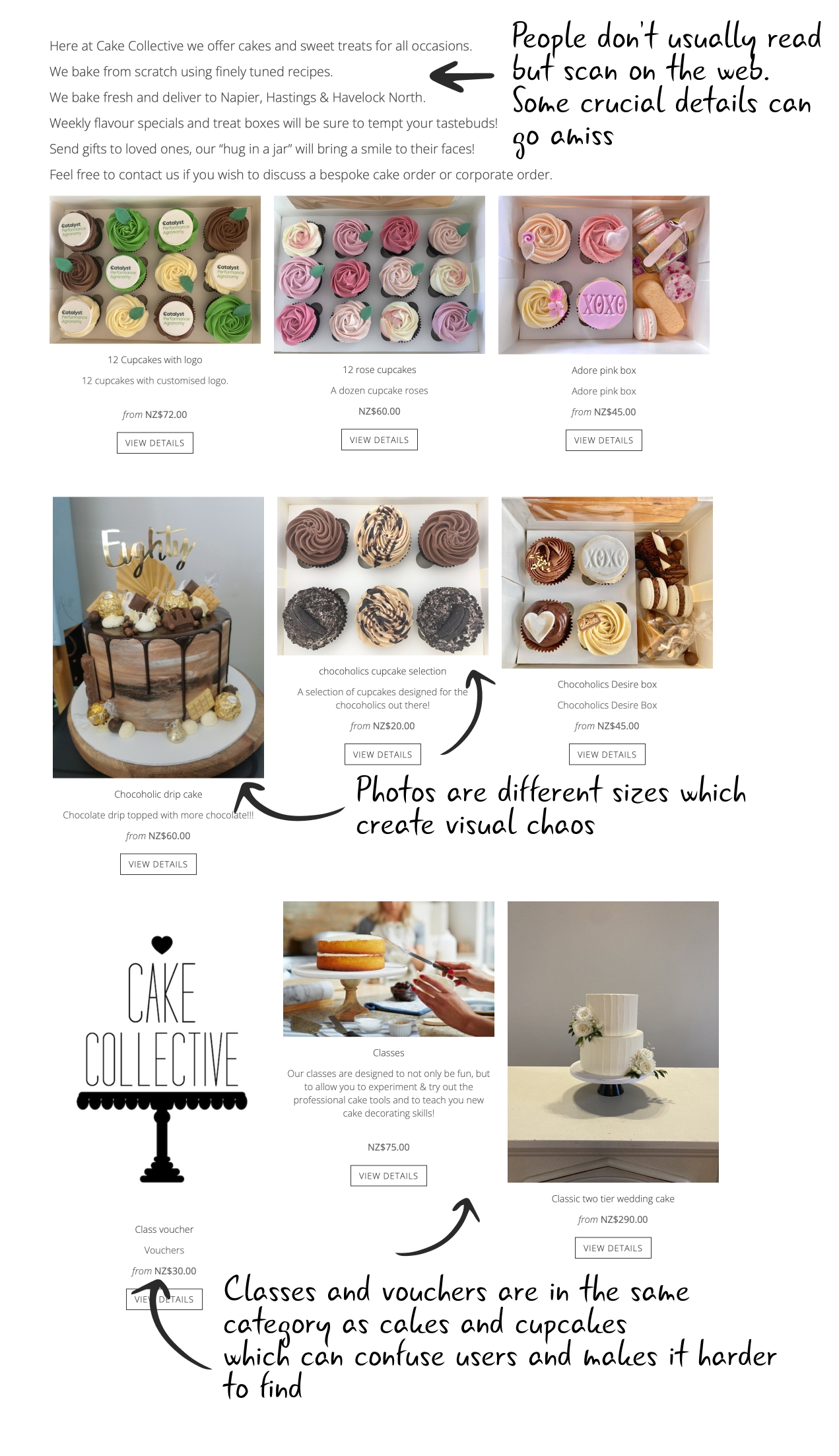
The business experienced a recent drop in conversions. The website felt outdated, the menu structure was confusing, and key selling points were not clearly communicated. Important actions such as purchasing were hidden below the fold, and unrelated items (like classes and vouchers) were grouped with products, creating friction in the user journey.
Research analysis
Competitive analysis showed that positioning the brand around quality ingredients and a “premium” feel could help differentiate it in the market.
User survey & interviews
I conducted user surveys and interviews to better understand purchasing behaviour and expectations around online bakery experiences.
User interviews
- What's the most important to you when you order baked goods?
- How often do you order on mobile?
- How important is home delivery when you pick a bakery?
- Which flavors of cupcakes do you enjoy?
- How frequently do you purchase cupcakes?
- What factors do you consider while buying cupcakes? (price, flavour, ingredients)
- Which location would you prefer to buy our cupcakes from? (physical store, supermarket, online)
- What is your age range?
Questions for the existing customers
- Please share any additional comments or feedback about our cupcakes.
- What improvements would you suggest for our cupcakes?
- From 1-10 how easy do you find exsisting websites?
- How did you hear about Cake Collective?
- Which flavors of cupcakes do you enjoy?
- How frequently would you purchase our cupcakes?
- Would you recommend our cupcakes to others?
- How would you rate the taste of our cupcakes?
Key insights from user interviews
Key insights showed that a smooth checkout experience and home delivery were crucial—especially for busy parents. Some older users also reported confusion during checkout, highlighting usability issues in the existing flow.
Card sorting
I asked 10 potential users to redesign the content of the menu. I used card sorting method in Lyssna.
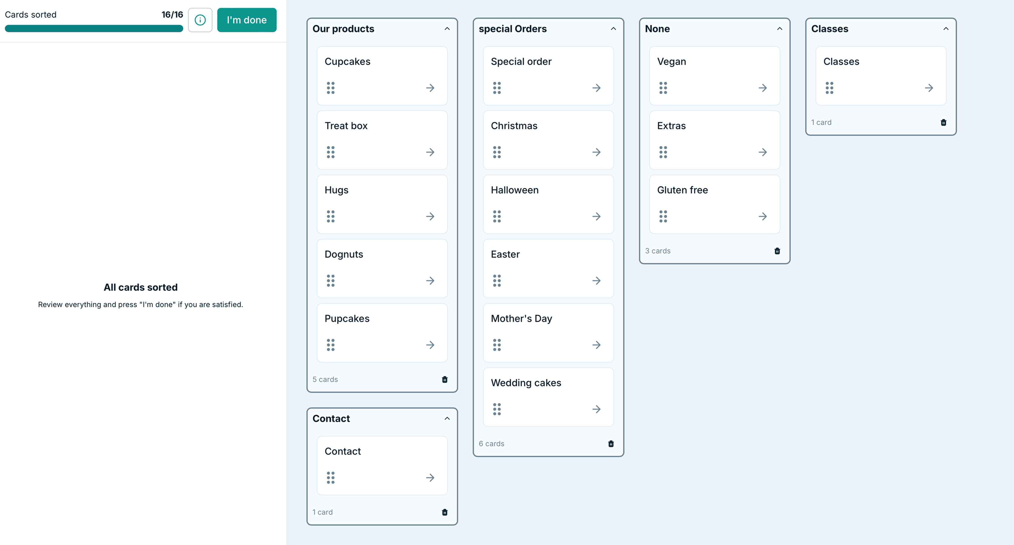
Outcome
The redesign focused on simplifying navigation, improving information hierarchy, and clearly communicating key value propositions.
Validation
The proposed solutions were validated through multiple research methods, including user testing and A/B evaluation.
Impact
Reduced average checkout time from 4:12 min to 1:58 min (–53%)
Increased conversion rate by 20% within the first month following implementation
Improved customer satisfaction score (CSAT) from 3.8 to 4.6 / 5
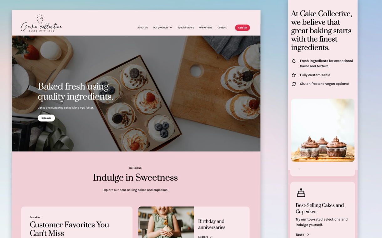
Final design